5 Web Design Mistakes That You Need To Avoid Right Now
Lately, I have been seeing several business owners that have gone through website redesigns. The sites look beautiful but have tons of basic mistakes that are costing them conversions and ultimately money. It really is amazing to see such amateur mistakes from webdesign companies that are supposed to be professional.
Responsive Website Design
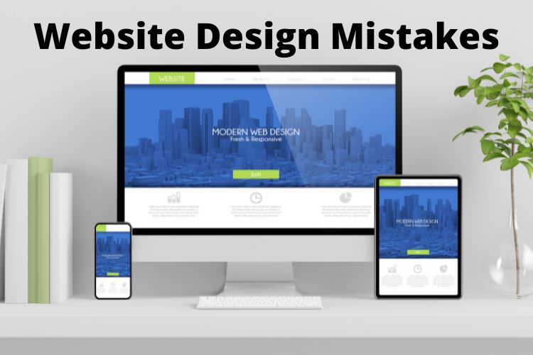
It’s very important that your site be mobile friendly. More people are viewing sites on a mobile device than on a desktop these days and the simple mobile websites that we used to redirect to are not cutting it anymore. Your website visitors are looking for a full site experience and not a scaled down version.
If your site is not mobile responsive, then you need to take action today and get it converted. This will take you one step closer to increasing conversions and ultimately your bottom line.
Using Sliders On The Homepage
Lot’s of web designers like to use sliders on the homepage. This is really not a good idea for a couple of reasons:
- Sliders have low conversions rates. No one watches to see if something they are interested in is going to come up. The conversion rate of people clicking on them is less than 2%.
- They are bad for SEO. Most are run by javascript and having that above the fold really is not good. Another reason it affects SEO is the use of multiple header tags with the keywords in it. Having multiple H1 tags with various keywords is just not good for SEO and is confusing for the crawlers.
- They are confusing and distracting. They waste valuable space that should be used to convey your message with a strong headline.
Unorganized Content
Many web designers are focused totally on the design. The proper way to build out a site is to construct it around the content. Words sell…So your content needs to be organized in a way that keeps your visitor interested and on your site.
All of this begins with understanding who your customer and potential audience is. That content should be developed for them and then the appropriate imagery added to enhance that content.
If a designer just starts designing and doesn’t understand the content, your site will not be organized in a way that increases conversions and sales.
Poor Readability and Legibility
Having a site that can be read easily is a must. This means using the right kind of font and right size of font is necessary. Fonts like Open Sans are great for sites.
Another point on readability is to limit using “all caps” in your headlines and text. While it can be acceptable to use all caps in the headline, it is really better to not do it. The great copywriters of the past and today will tell you that conversions are higher when you follow this principal.
No Phone Number Or Address Above The Fold
I recently saw an attorney site that was redesigned by people who claimed to be real professionals and brand experts. I saw the sight the day that it was launched. There was no phone number or address above the fold of the site. For a local business this is a must.
Web pages are read above the fold in a “Z” shape. It is important to have your contact information in that “Z” shape somewhere. Preferably at the top right or top left corner. Most follow the “upper right, big and bright” moto for contact information.
You definitely need to make sure that phone number is clickable on a mobile device.
Audit Your Site Often
One thing that is important is that you take an audit of your site on regular basis. You need to make sure that your site is up to date on the latest SEO, Conversion and Design standards. You don’t want to look like your site is outdated especially when your competition is staying up with the latest trends.
If you would like an audit of your site, then you can contact us and we will be glad to do it.

